
Nuçi's Space
* BRAND IDENTITY { ART DIRECTION
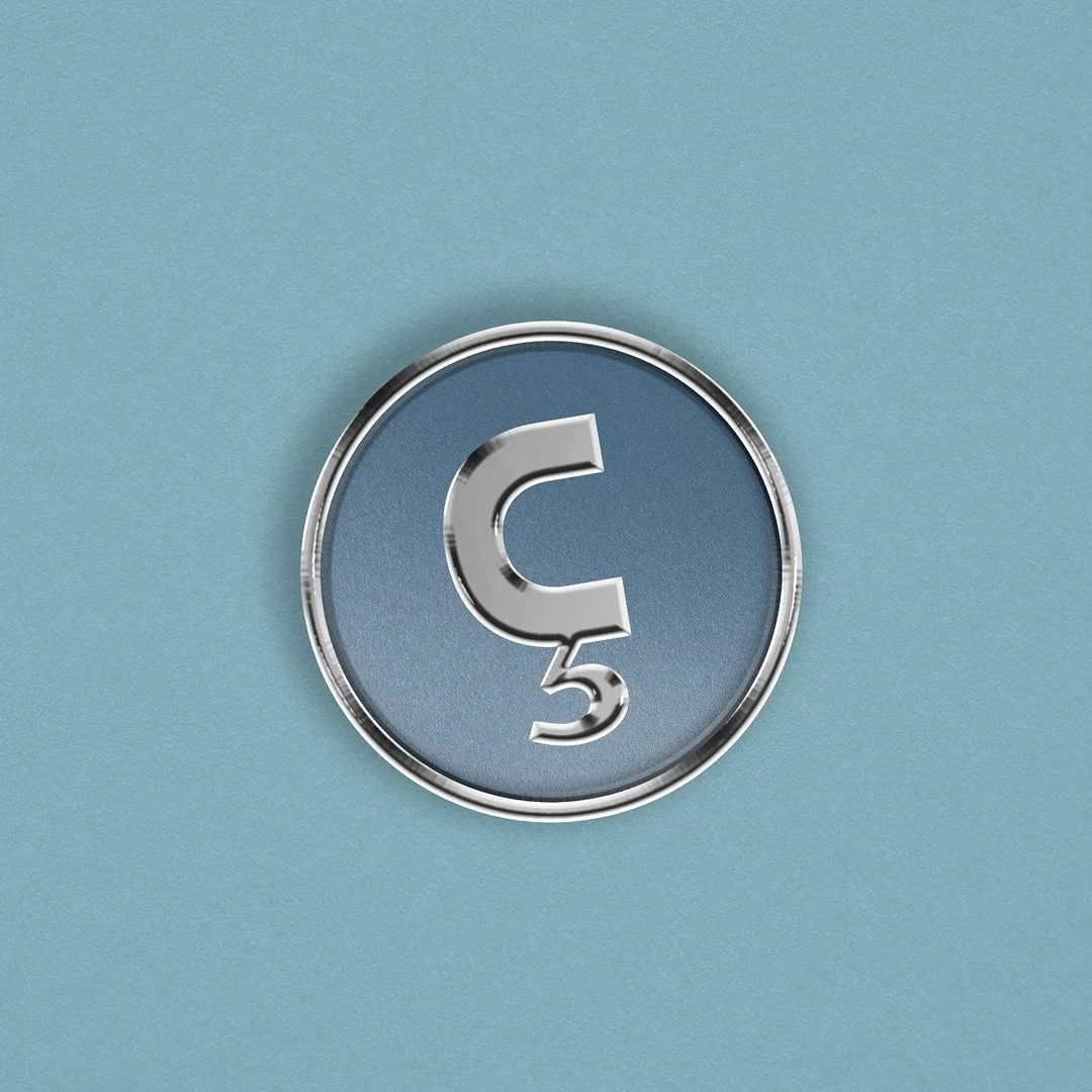
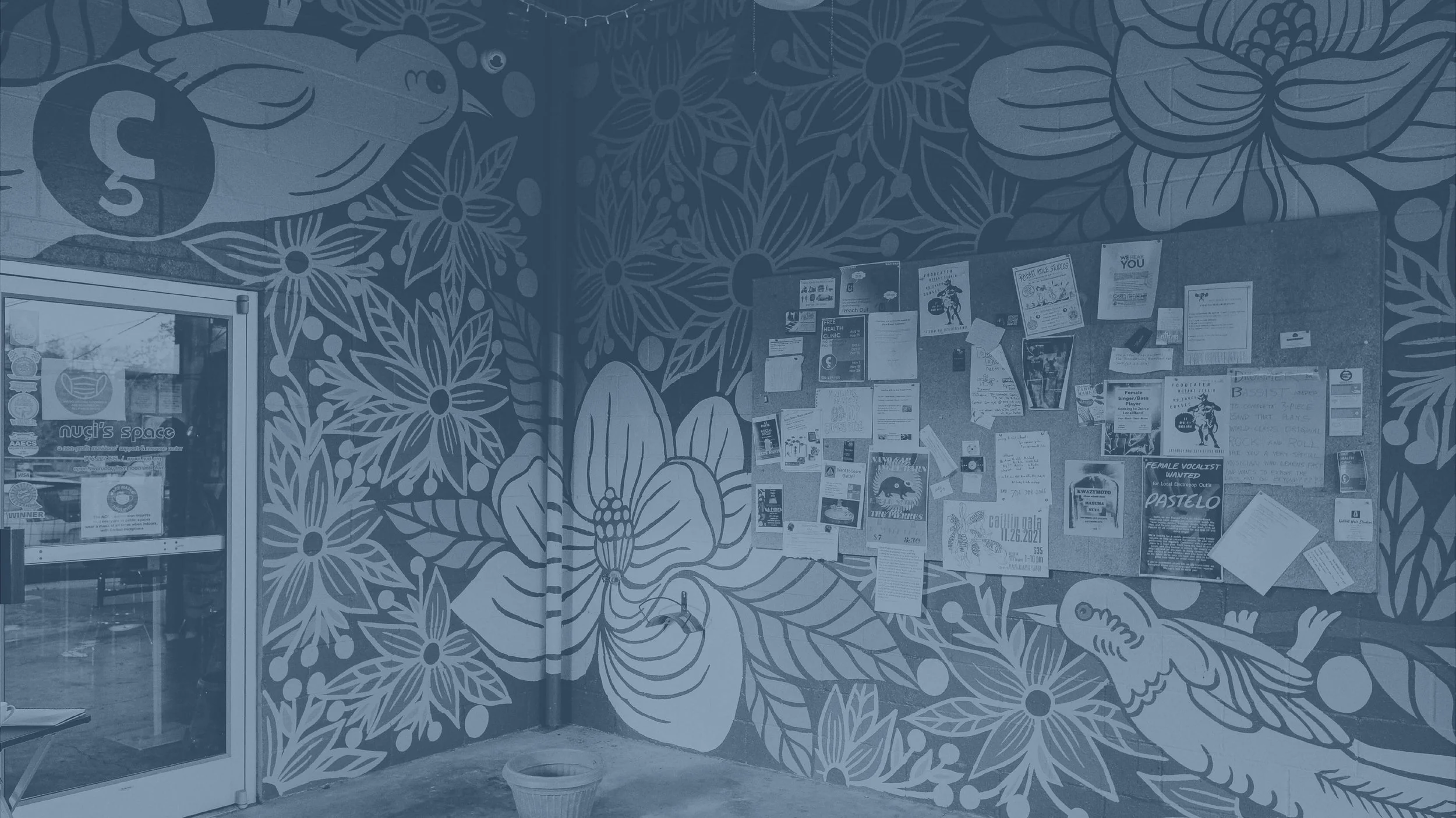
Nuci’s Space was the winner of our 2024 Do Good Project. Nuci’s Space came to us with a fairly established brand. If you’re an Athens, GA local and you don’t know what Nuci’s Space is, you have likely at least seen one of their iconic blue cedilla stickers on a neighbor’s bumper or perhaps an amp onstage at a show.
Nuci’s Space on Oconee St is a haven for musicians. They have a stage, recording studios, a cafe, and sell used gear to a ton of local bands and artists. They provide a safe space for musicians to come together, and host a range of events and camps
throughout the year geared toward the Athens community and toward kids.
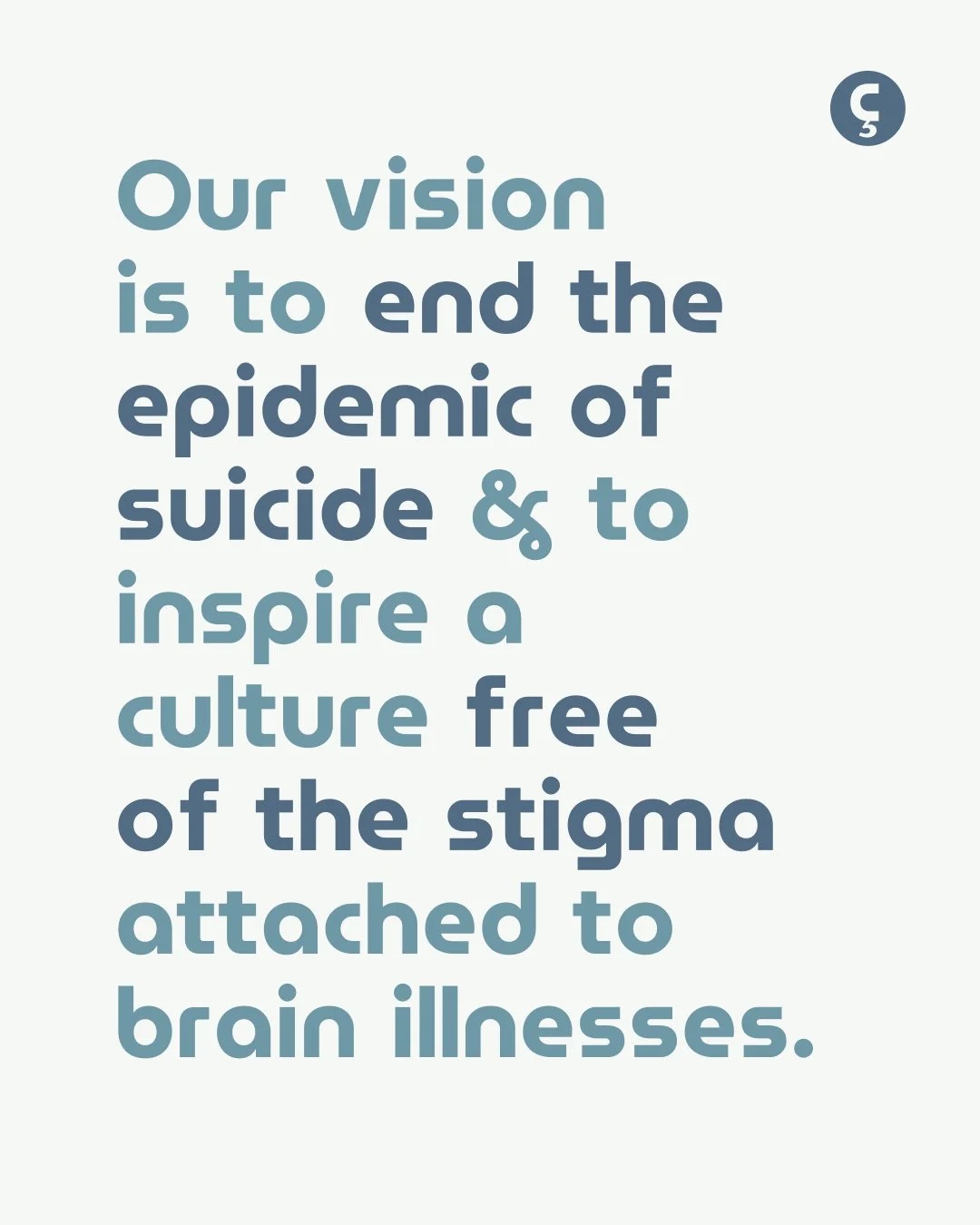
But the real heart of Nuci’s Space and the purpose of their nonprofit is to end the epidemic of suicide. They offer free resources to anyone who comes in the door, and foster an environment for candid conversation about loneliness, depression, and suicide. Their services have saved countless lives, and the QPR programs they host help inform others about the risk of suicide and how to talk about it.

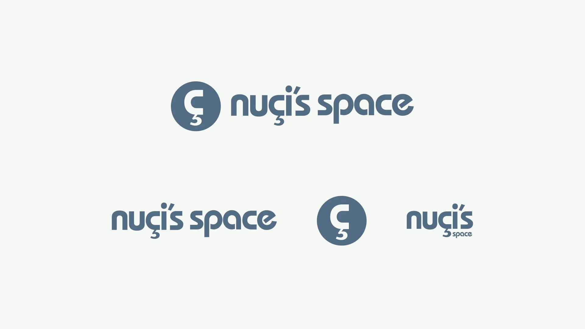
The challenge of working with a brand as beloved as Nuci’s Space is creating tools that will make their team’s lives easier, without straying too far from what currently exists. Their cedilla icon was too iconic to be scrapped, so we focused instead on cleaning up their wordmark and translating that to the icon. We tightened the kerning on their wordmark and made the cedilla and the c wider to fill in space.
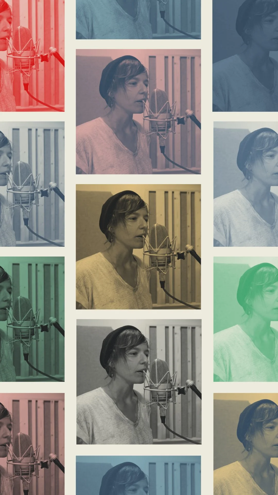
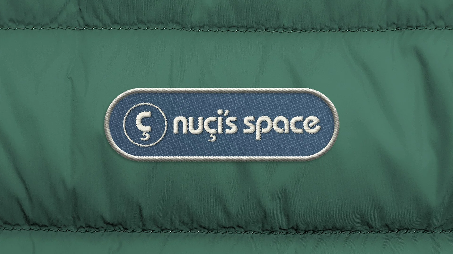
For the color palette, we started with their blue. Nuci’s Space is quickly recognized by their blue
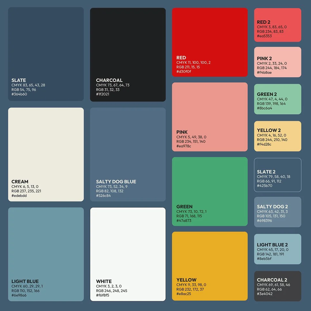
color, which appears in their logo and also on the front of their building. However, being limited to a palette of just blues made their graphics feel stale and a little gloomy. We tweaked their main blue color to be closer to the actual color of their building, and from there we built out an extended palette. More colors gives their team the flexibility to bring more vibrancy into their marketing materials, and better reflects the vibrant experience of walking in their doors.
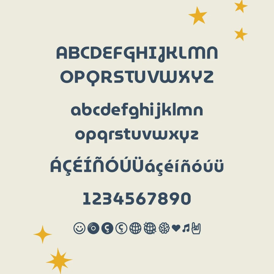
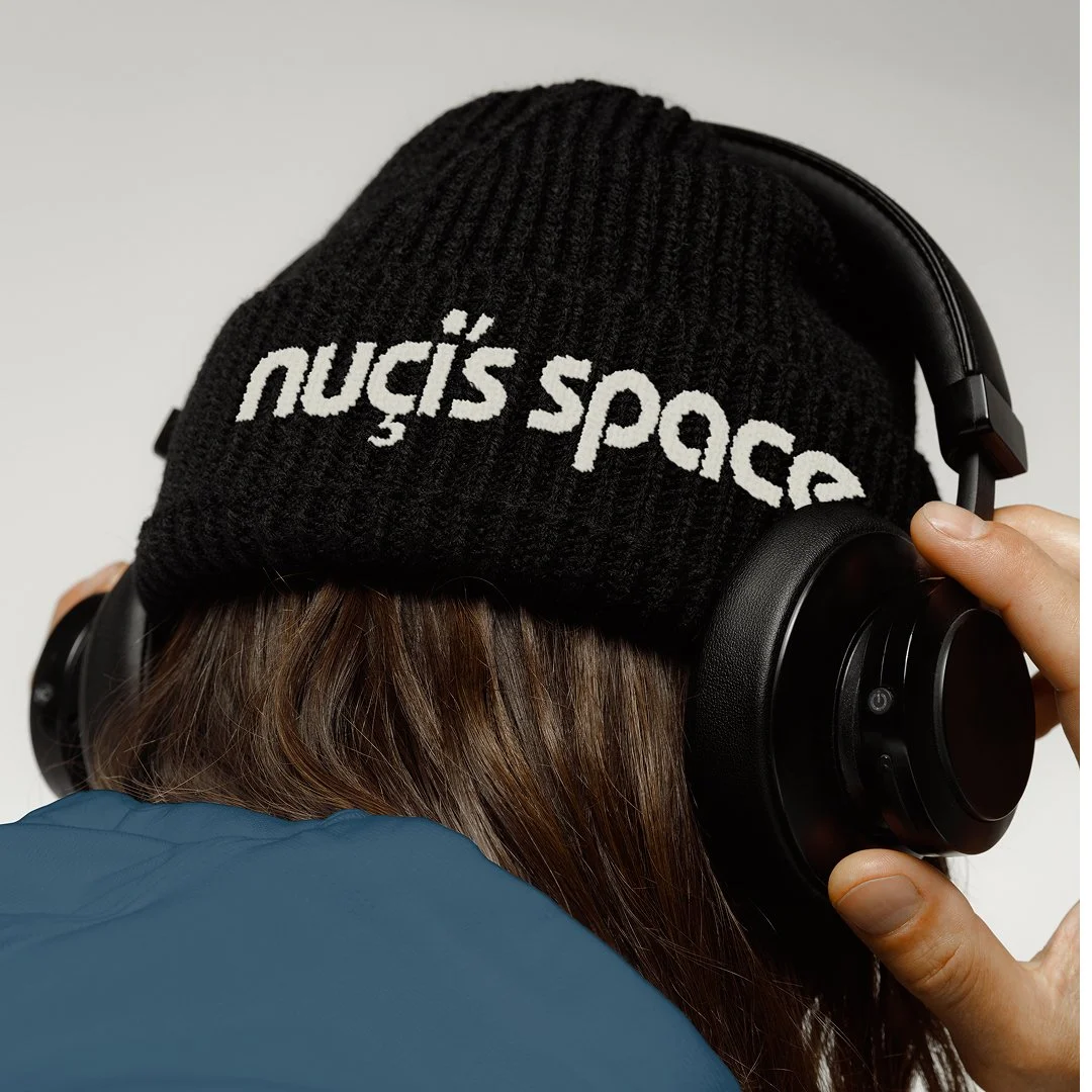
We chose two open source fonts for Nuci’s Space to use in all materials. Their brand kit uses a version of Museo Moderno, which we modified to automatically use some of the less wacky glyphs for letters such as the E & G. We also added in custom icons for their team to use!