Dirt Road Studios
* Brand identity % Photography = PaCkaging
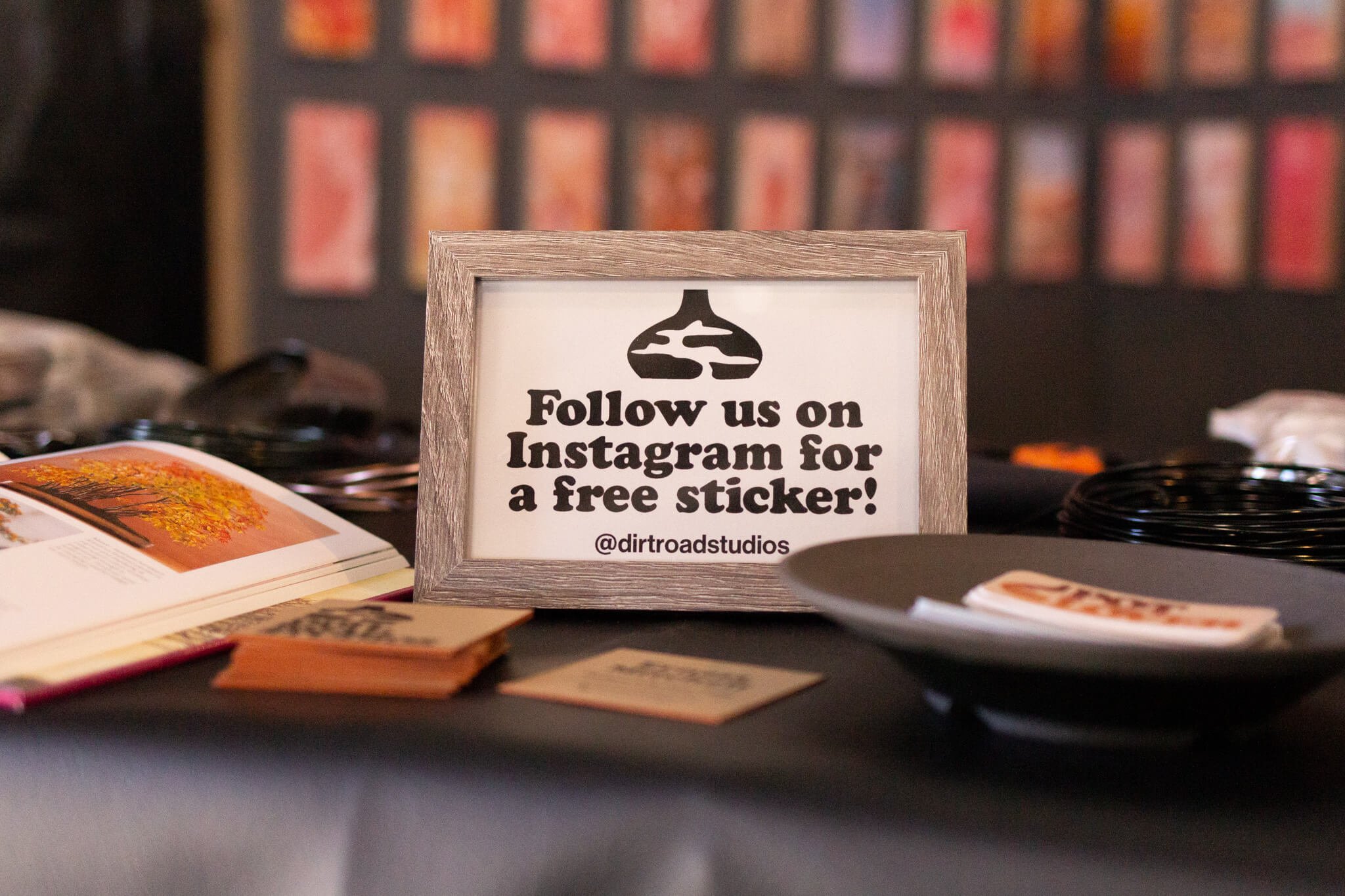
Designed with vintage t-shirts in mind, Dirt Road Studios’s logo uses Cooper Black to bring back those old school feels. The icon was hand drawn to keep a natural feel to the shape.
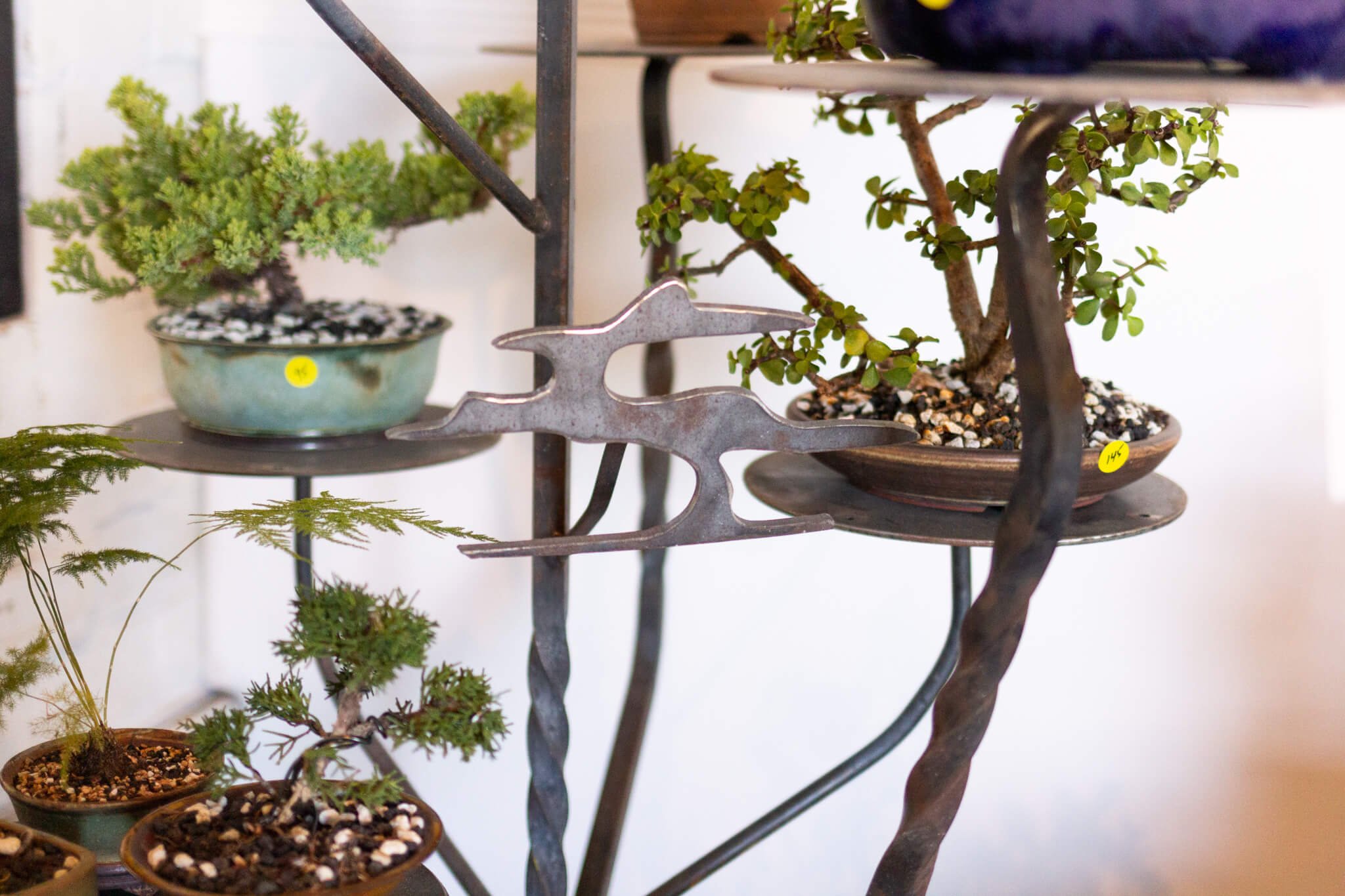
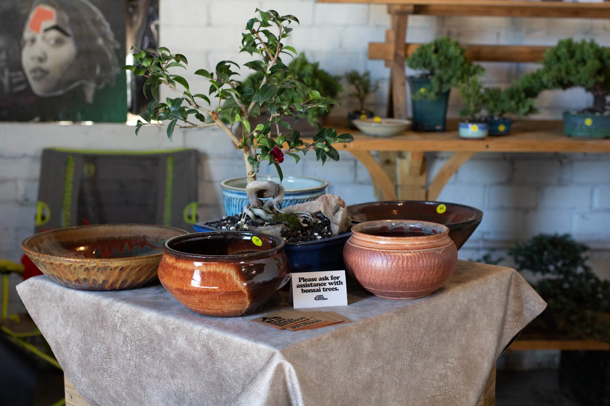
The logo is applied in various natural looking mediums to keep a consistent natural feel. Cut metal and kraft paper compliment wood, leaves, and ceramic textures. The brand embraces a witty, hippie personality with it’s tone and visuals.
It pulls together Dirt Road Studios’s offerings by featuring the silhouette of a bonsai tree inside of the form of a decorative pot to make a recognizable symbol.
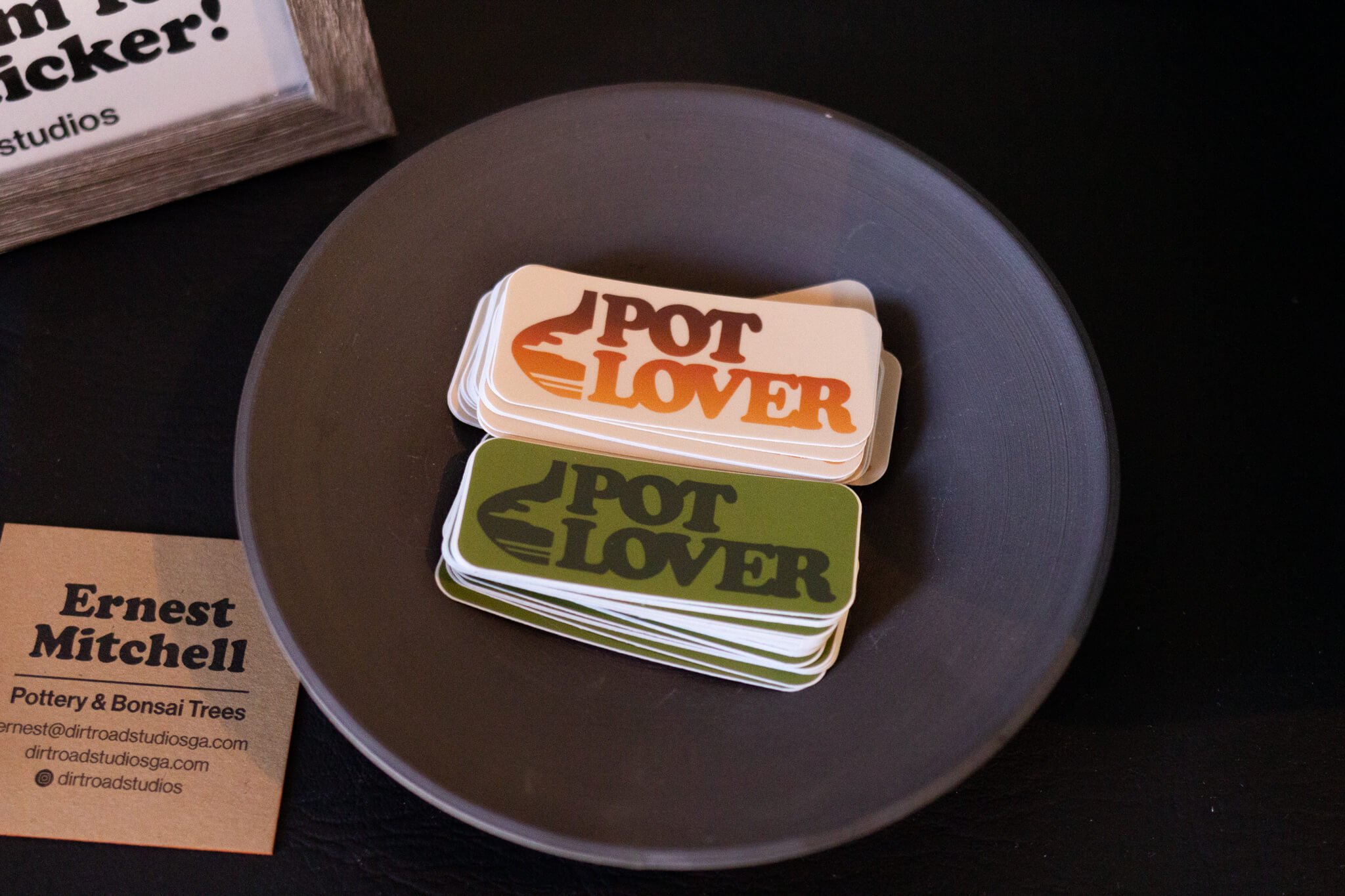
The typefaces used are classics from the 70s, and tie dye t-shirts give the brand an earthy feel. Custom “Pot Lover” stickers were designed as a tongue in cheek goodie for customers who really do love pot(tery).

